The art of writing microcopy
This post was originally published in August 2016 on GatherContent. It was written by Lucie De Lacy and Christine Cawthorne of Crocstar.
Microcopy is the unsung hero of copywriting.
Used in apps and transactions, microcopy or short-form copy is the text you see on buttons, labels, fields and in error boxes. It tells users what to do, explains anything that could be confusing and injects moments of personality and delight.
Simple, right?
If only. Those phrases, one-liners or even single words are often the hardest to write. They have to be direct, without lacking the tone of voice that brings the organisation to life. They need to clearly guide your users so they have confidence in what they’ve selected.
Microcopy enhances UX
User experience design aims to make things feel intuitive for the person using your app or platform. Microcopy needs to act in the same way.
Just a few, carefully chosen words can go a long way in apps and can stop users struggling or dropping out of the process altogether.
Microcopy shouldn’t explain the design. It should enhance the user experience, working within context and to answer the question a user might have. For example: The copy on a button shouldn’t tell users to click it. It should say where they will go next, or what will happen when they press it, ie, it saves the information.
Let’s look to Slack for a great example of this.
To create a Slack team, it’s a lovely five step process that involves you putting in the minimal information Slack could get away with asking.

Within this process, their microcopy gives the users a helping hand – for example it eases the pressure of having to come up with a permanent team name on the spot. This allows the users to get through the onboarding process and start using Slack as quickly as possible.
Sensitivity is important
If we look at forms, there are many ways you can ask for the same type of information. For users, it might not correspond with how they want to be asked – making it clunky and difficult for them to easily answer. We’ve all had that moment where a field asks what country you live in and we ponder which letter to scroll to – England, Britain, Great Britain or United Kingdom, we’ve seen them all used.
Wouldn’t it be helpful if the form had a little more context to what the form was asking for and why.
Content strategist Sara Wachter-Boettcher has spoken about questions in forms that bring up painful emotions. In her post Personal Histories she writes:
“I’m filling out a new-patient form online for my doctor’s office when I see it, sandwiched somewhere between “Do you smoke? and “Has anyone in your family had a stroke?”:
Have you ever been sexually abused or assaulted?
Yes __ No __
No context, no indication how this information will be used. No box to tick for, “Well, yes, actually, but that’s not why I am visiting you and I don’t know you and I have nothing to be ashamed of and I’m not afraid to talk about it but really I’ve done my talking already and mostly I just want my annual exam, not a bunch of prying questions or sympathy or anything, actually, from you.”
No space to breathe. Just a tidy little binary for a story that doesn’t feel tidy at all.
Someone probably had good intentions when they added that question to their intake screener. But they didn’t tell me what those intentions were. As a result, I was left feeling uneasy and exposed—my personal history on display and out of my control.”
In her blog post, My new favourite form. Really, forms specialist Caroline Jarrett says:
“I’ve been collecting example forms forever, but as I mentioned: making a better form isn’t easy, and it turns out to be even harder to make a good form. I often find parts of forms that are fine - but there’s some detail or other that isn’t right. The patterns might be good but the instructions aren’t. Or both of them are fine but it’s weighed down with too many questions.”
You need to balance what information you need, why, and what the person filling it in is expecting. Caroline adds:
“A good form is legible and looks organised. It certainly can’t be a good form if you can’t understand the questions. But the real winner, the thing about a form that makes it truly successful, is if it lets you do whatever you need to do - easily.”
Error messages shouldn’t blame users
If something goes wrong, users generally blame themselves. Error messages are the first line of customer support and if written poorly they can increase technical support costs, frustrate users, lose sales, and reflect badly on the app or service.
What they need is to be guided out of and reassured if they’re having trouble. You’d be surprised at how effective a few small words can be in this situation.
Take entering a password. This is a general annoyance for most of us as some point during the day. The thing we don’t notice is where after two attempts, we might get a prompt on screen that jogs our memory.
“Oh! It was a capital D, not a lowercase one.”
Just like that, the user can move on, and get to on with whatever they needed to do.
Every interaction a user has online has the potential to be charged with emotion. What we need to do as copywriters is reflect this with empathy, tapping into where our users need help, and giving it them.
A good error message tells users:
what happened
why
what the error means for them
what they can do to stop it happening again
The error message must include enough information to solve the problem - using language that they will understand.
Stick to your style guide
As well as helping users, microcopy also gives you chance to flex your style guide and have a bit of fun with it. Be informative, but also add personality wherever you can because microcopy really helps your tone of voice come to life.
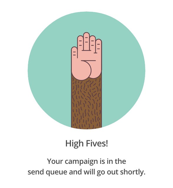
Mailchimp does this beautifully as they inject ‘moments of delight’ after you’ve achieved your goal, which means the copy doesn’t get in the way of what you’re trying to do. The copy also works with the graphics to add a layer of personality, rather than functionality. Have a browse through the Mailchimp style guide to see how they do it.
Fashion retailer ASOS has been enticing us to part with our pennies for many years now. Their tone of voice is very friendly indeed, especially during the signup process. Take a look at how they incorporate the words of their target audience - ‘super quick’ and ‘fail’ - they even drop in a hashtag at the end. It’s achingly hip.

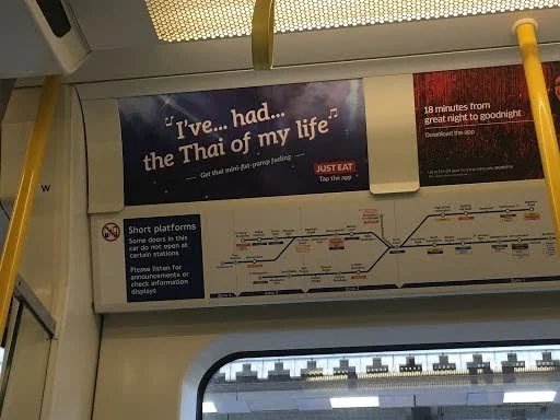
If you can get this right, a career in advertising may well be for you, and your copy won’t just appear digitally. Although the copy in Just Eat’s app is straightforward, the offline adverts are just genius.
Test your microcopy
To see whether your copy is working, test it during user research. Observe users to see where they are pausing or struggling to do what you expected. It could be the content doesn’t support the design or confuses the user.
It can be tempting to fill screens with explanation but this can clutter up the page or distract from the design.
We couldn’t talk about testing copy without mentioning GOV.UK and its focus on user research. In his blog post tips for testing your words, user experience researcher and designer John Waterworth says:
“If I had to guess, I'd say that for government services, 60% of our user research and design effort is about the words we use.”
He recommends several ways to test words, including:
listening to the words people use
asking users to highlight words
asking people to think aloud
If you’re interested in testing your copy, take a look at this post we wrote looking at the different ways to test content.
Writing microcopy isn’t easy. In fact, it’s probably the hardest copy of all, being at the mercy of context, design and function. That’s probably why it feels so good when you get it right.